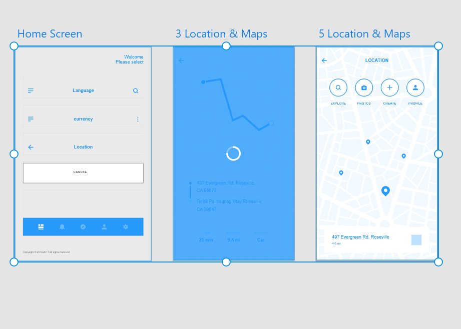
USER FLOW
All that you feel is a GAP have been listed down.
Use LOGO, icons, symbols etc. for Identification.
Stick to all the Norms/ Regulation and law related to it design because you know brand identity must remain intact while designing.

There is this Quick way of learning XD and keeping your wireframes and prototypes ready for market.(Keeping in mind the colour Theory, typeface and pixel)
Refer W3Schools for deeper information on the A2Z process of it.
Be clear as how your Splash Screen, home Screen and Landing screen should look.Use features like Gradients to emphasize.
TIP: Make an Information Architecture and select wireframes from UI kits accordingly.
Having the perfect Information Architecture is what makes you the best designer and for that read lot and travel a lot and get information from wherever possible.
When ever we use an app, we often realise if it was easy to
operate or not. That is because of its flow – easy onboarding, prominent
important features, good infographics etc. And ya if you don’t realise that’s
because the flow was really good that it never occurred to you if there was
something missing.
When we are building apps and want to give the best user
experience possible it becomes inevitable to understand them and provide and also
place the features conveniently as they would have got it and had the flow in
real life.

Example here is
Brief-
Wireframes for an app for NRE spouse or guardians for money remittance.
Persona-
Not able to trust digital modes and would like to have cash withdrawal mechanism.
Importance for type of
currency, language barrier and easiest way for information on balance and withdrawals. A user flow which is conventional yet understandable.
currency, language barrier and easiest way for information on balance and withdrawals. A user flow which is conventional yet understandable.
Checklist for the same: -
1.
State all the features in order and make a flow.
2.
Write all that you want in certain features, and make the easy onboarding possible.
3.
The end and offboarding should be smooth as well and user should feel like visiting our website again and again.
4.
Make sure it (each icon) has clear way to somewhere and ends it flow easily.
5.
It is always easy for user to return to its features( like home, back to previous etc.).

And my journey in User experience is going on.........
Stay tuned for more


